

Today is a beautiful day, the sky is blue and same as the IKEA architecture. Som and I went there to experience the IKEA in Sweden. The layout of the interior space is indeed almost identical to the ones in Hong Kong. I spotted a few similarities and differences.


1) Directing signs telling us where to go are everywhere. Since the interior space is huge in this Ikea store, each floor has more than one possible way to walk around. There are alternatives instead of just following the arrows. The Ikea in Hong Kong is much smaller and there is no alternative as I remember. There is no IKEA store in Thailand yet. Som said that the arrows are not "useful" for her since she hadn't noticed it until I told her the signs on the floor.


2) Shopping bags (yellow color) are always available on the way. This is same in Hong Kong.


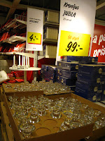

3) Yellow labels with discounted prices are everywhere. The use of the yellow color is one of the strategy to attract consumers' attentions. Many supermarkets use the same strategy. This color is a symbol of "discounted price" and "cheap".


4) Standardization of space. IKEA gives ideas on how people can organize their limited space.

5) "Open your wallet items" are found easily.
Experiences from Som and Christine.
Its really nice to see such post. Gave me a visionary reflection about my idea. Swedish furniture's are really good for decorating homes and office. Alternative to ikea stores is the best place for this kinds of furniture's.
ReplyDeleteI really like your take on the issue. I now have a clear idea on what this matter is all about.. bed bug mattress cover target
ReplyDelete